Since OpenShift 4, updates are rather trivial. You wait for the new update to appear, press the button (or use the CLI), wait a bit, and the update is done. True, in production you might want to complicate that process a bit, for good reason.
Running an OpenShift 4 cluster now for a while myself, and developing apps on top of Kubernetes on my day job, I am curious about the next release. Is it GA already? Can I deploy it? Is there an upgrade for my current version? Is that in “candidate”, “fast”, or “stable”? Checking that turned out to be no as easy as it should be.
A bit of background
The tool behind the OpenShift update information is openshift/cincinnati:
Cincinnati is an update protocol designed to facilitate automatic updates. It describes a particular method for representing transitions between releases of a project and allowing a client to perform automatic updates between these releases.
https://github.com/openshift/cincinnati
Which means that this tool has all the information available to show which upgrade is available. And from which version I can upgrade. It also has the information about all the different channels (like “fast”, “candidate”, or “stable”). And it is written in Rust, I love it already.
There is a little bit of information on the data format, but what about the data itself? It is available from the endpoint https://api.openshift.com/api/upgrades_info. So now have everything that we need.
The solution
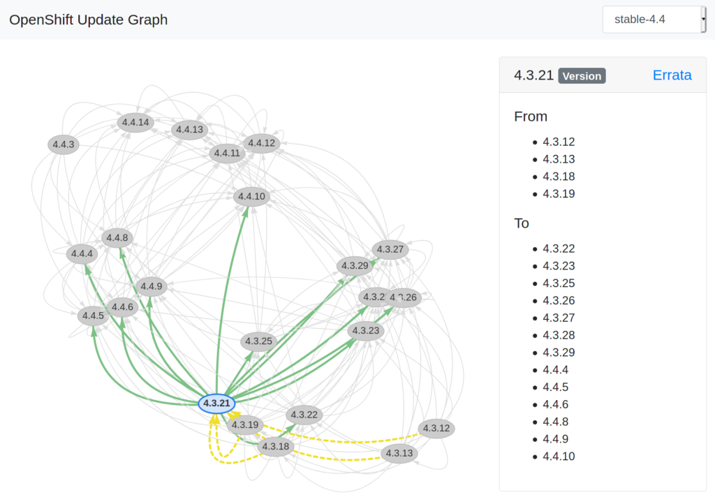
To be honest, there is nothing too difficult about it. You have all the data. There already is a nice example using graphviz in the repository of OpenShift Cincinnati. The problem with the example is, you need to run it every time an update gets posted, for every channel. It will generate a static graph representation, so you have no ability to zoom, or re-arrange. It would be nice to have bit more interactive visualization of that graph.
A few hours later, and with the help of visjs, jQuery, Bootstrap, and some plain old Javascript, you have something more interactive: https://ctron.github.io/openshift-update-graph/
The challenges
As always, it should be simple. But in real life, nothing is. Of course I encountered a few obstacles to work around …
Hosting a web page
Hosting a simple, static, webpage used to be so simple. Put a file into a directory that Apache publishes, and your are done … Today, I also could set up a Tekton pipeline, build a new image, and “run” the webpage in a container, on a cluster, proxied by one or two more HTTP reverse proxies.
The truth is, there are now so many options when it comes to hosting a simple web page, it can become a tough decision. I wanted to keep things together closely. Most likely I will build it, use it, and don’t want to actively maintain it (forget about it). Git and GitHub are obvious choices for me, so why not simply host this with GitHub pages, using the same repository I use for coding. As it turned out later, that was the right choice and helped with a few other obstacles as well.
CORS & headers
Having an online API, HTTP based, should make it so simple to get everything you need, directly from the user’s browser session. The only thing that would be necessary, is to host the web page and a bit of JavaScript.
Unfortunately, the update API is rather picky when it comes to doing requests. It’s missing CORS headers, and using a general purpose CORS proxy turned out to lack the correct HTTP headers that the API requires. I wanted to focus on the visualization and wanted to stick to the plan of simply hosting a static web page, not running a CORS proxy myself for this.
Then again, the only thing I do to with the API, is to perform an HTTP GET request. As there is nothing dynamic about it, I could as well host a JSON file, and fetch that. I would only need a process to update the JSON data.
Now I was glad that I chose GitHub for all of this. Setting up a GitHub Actions workflow for updating the data is rather simple. The command was already part of the original example, with the only difference, that I don’t need to run graphviz. The workflow will fetch the data, and when git detects a change in the data, the workflow will commit and push the changes to the same repository. Great plan, but …
Data formats
… the data format is not stable. Doing multiple GET operations on the endpoint give you back different content. True, the information is the same, but the “byte content” is different. The data format describes updates as nodes and edges, very simple and a perfect match for our purpose. However, the edges reference the nodes by their position in the list of nodes, and not by some stable identifier. Assume the following two examples:
{
  "nodes": [ "A", "B", "C" ],
  "edges": [
    { "from": 0, "to": 1 },
    { "from": 1, "to": 2 },
  ]
}
{
  "nodes": [ "C", "B", "A" ],
  "edges": [
    { "from": 2, "to": 1 },
    { "from": 1, "to": 0 },
  ]
}
Both examples contain the same information (A → B → C), however the raw bytes are different (can you spot the difference). And git diff only works with the bytes, and not the actual information conveyed by those.
So my plan of periodically fetching the data, and letting git diff check for differences wouldn’t work. Unless I would create a small script that normalizes the data. Running that as part of the update job isn’t complicated at all. And now the diff can check if the normalized data changed, and only act on that.
Why do I keep the non-normalized data? Yes, I could let the visualizer use the normalized data. However, I would like to use the original data format. In the hope that some day, I would be able to use the API endpoint directly.
No API for channels
I wanted to visualize all channels, with the different versions. Turns out, that there is no API for that: openshift/cincinnati#171. But I also didn’t want to maintain an update-to-date list of channels myself. A thing that I will forget about sooner or later. Nothing a little shell script can fix. In GitHub actions, performing a checkout is simply yet another action, and you can check out multiple repositories. Of course, you don’t get triggered from those repositories. But we are running a periodic workflow anyway, so why not checkout the graph data repository, and check for the channels in there.
Why didn’t I use the data contained in the channel directory of that repository? I wanted to really stick to the original API. There is all kinds of processing done with the data in there, and I simply didn’t want to replicate that. Finding all the channels as a workaround seemed fined though.
Nervous graphs
Once the graphs grow a bit, they can get rather complex. visj has a “physics” model built in, which helps to balance the layout when you drag around nodes. However, every now and then the layouter and the physics model seemed to produce funny, but useless results. Depending on the model, a simple reload, re-starting the layouting algorithm with a different seed fixes the problem. But that is a bad experience.
Luckily, you can configure all kinds of settings in the physics model, and playing around a bit with the settings lead to some settings, that seem to be fun, but stable enough, even for the bigger graphs.
What is next?
Not much really. It is a tool for me that just works, showing OpenShift updates with a click. The itch is scratched, and I learned a few things in the process. And I hope that by sharing, it becomes useful for someone other than just me.
Of course, if you think that something is missing, broken or could be done in a better way: Open Source is all about contributing ;-) → ctron/openshift-update-graph